
Reading Price Action: What the Tape Is Really Telling You
A professional framework for reading price action — beyond candlestick patterns. Real-world examples with entry logic, exit rules, and risk management.


Rachel Kensington
Senior Equity Analyst · Blue Ocean Trading Solutions
Most Traders Are Reading the Tape Wrong
Here is an observation that holds up across every market environment: the majority of retail traders treat price action as a pattern-recognition game. They hunt for hammer candles. They draw head-and-shoulders formations on everything. They count ABC waves. They are, in other words, solving the wrong problem.
Price action trading is not about identifying shapes on a chart. The tape suggests something far more fundamental: price is a real-time record of every decision made by every market participant, aggregated into a single number. That number, and the way it moves, tells you who is in control—buyers or sellers—and how much conviction they have. A hammer candle means nothing without context. A breakout above resistance means nothing without volume confirmation. A reversal pattern means nothing if the broader market structure says otherwise.
The distinction matters because indicators lag. By definition, any indicator derived from price is a function of what has already happened. Price action itself, read correctly, is the leading signal—not a derivative of it. The traders who consistently extract edge from markets are not better at drawing trend lines. They are better at reading the intent behind price movement. That is what this piece is about.
Key Insight
Price action is not about memorizing patterns. It is about understanding the supply/demand imbalance behind each price move — and whether that imbalance is likely to persist or reverse.
What Price Action Actually Is
Beyond Candlestick Patterns
Most introductory trading content conflates "price action trading" with "candlestick pattern trading." These are not the same thing. Candlestick patterns—dojis, engulfing candles, morning stars—are one narrow slice of a much broader discipline. Price action trading encompasses the full structure of the market: swing highs and swing lows, support and resistance zones, trend direction across multiple timeframes, volume behavior at key levels, and the character of price movement (impulsive versus corrective, wide-ranging versus compressed).
The fundamental question price action asks is: who is winning the auction? Every price bar is an auction between buyers and sellers. A wide-range bullish bar that closes near its high tells you buyers dominated that session. A narrow-range bar that closes in the middle says neither side had conviction. A bearish bar that starts strong but wicks back up aggressively suggests sellers tried to push lower and failed. Read enough of these interactions in sequence and you start to see the narrative the tape is writing.
The Wyckoff Market Phases
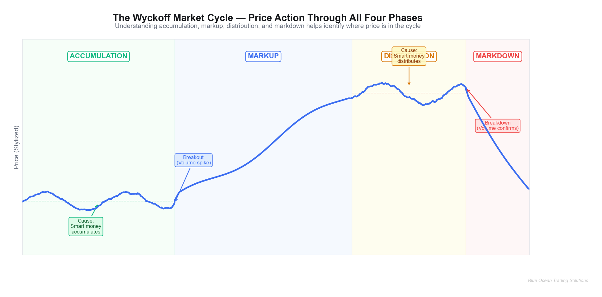
Richard Wyckoff's framework, developed in the early twentieth century, remains the most intellectually coherent model for understanding how price cycles through phases. The four phases—accumulation, markup, distribution, markdown—describe the behavioral pattern of large institutional participants who must buy and sell over extended periods without moving price against themselves.
In the accumulation phase, large operators quietly build positions while retail traders see a choppy, directionless market. Price oscillates in a range. Volume is elevated on down days early, then begins to dry up as sellers are absorbed. The tape is telling you: supply is being exhausted.
In the markup phase, price exits the range with conviction. Higher lows form consistently. Pullbacks are shallow and brief. Volume expands on up moves and contracts on pullbacks. The risk/reward profile here is most favorable for trend-following strategies—you are trading in the direction of the operator's position.
In the distribution phase, the mirror image unfolds at a higher price level. The range widens. Breakouts above resistance fail and reverse. Volume spikes on down moves. Large operators who accumulated at the lows are now distributing their positions into retail buying. The tape is screaming: supply exceeds demand, even if price hasn't confirmed it yet.
In the markdown phase, price accelerates lower. Each rally is weak and short-lived. Lower highs form consistently. Volume confirms the move.
Volume as the Confirmation Layer
Volume is the single most underutilized input in most traders' price action analysis. The reason is straightforward: volume tells you the conviction behind a price move. A breakout on light volume may be real, but it lacks institutional sponsorship. A breakout on volume 1.5–2x the average daily rate tells you money is flowing with intent.
The critical relationships to internalize: volume should expand in the direction of the primary trend and contract on countertrend moves. When volume expands against the trend—when you see a strong down day on high volume during an uptrend—the tape is suggesting distribution is occurring, even if price hasn't reversed yet. That is the kind of warning signal most traders miss because they are watching the price line, not the volume profile beneath it.
Price tells you what. Volume tells you why. Together, they tell you who.
Real-World Implementation: NVDA, AAPL, and TSLA
NVDA: A Textbook Accumulation-to-Markup Sequence
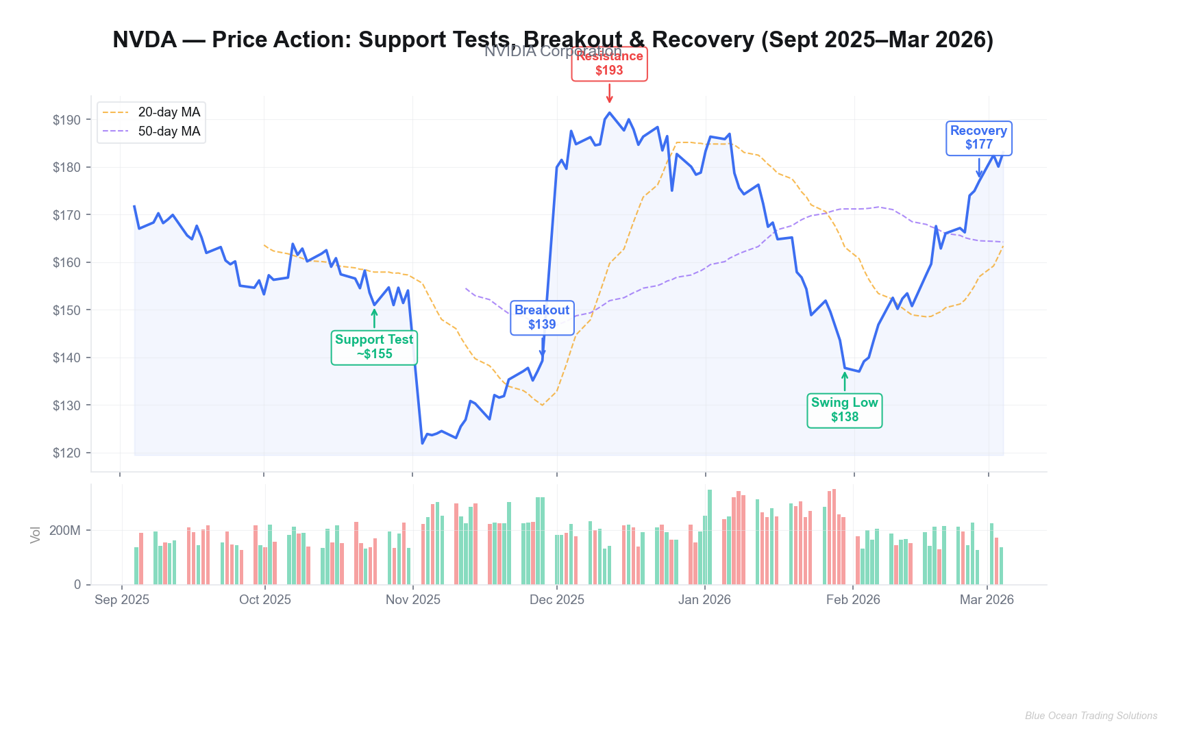
NVIDIA spent the better part of September through November 2025 in a defined consolidation range, cycling between roughly $122 and $165. Anyone watching price alone during that period would have seen noise—choppy movement with no clear direction. Price action is telling us something different when you examine the internals of that range.
The key signal was the behavior at the range low. By late October 2025, NVDA had tested the $150–$151 support zone multiple times. Each test was characterized by less downside follow-through than the last. The October 28 low of $150.96 saw a swift intraday recovery. Volume was declining on each subsequent test of support—a classic sign that sellers were being absorbed and supply was drying up.
Then December arrived. NVDA crossed above $175 on December 1, 2025—a level that had capped several prior rally attempts—on volume 1.5x its average daily rate of approximately 209 million shares. By December 12, price had reached $191.38. The risk/reward profile here was clearly favorable for anyone who had identified the accumulation range and positioned for the breakout: a stop below the October swing low near $150 with a target at the range top implied a 4:1 reward-to-risk ratio on the initial move.
January brought a sharp reversal—NVDA retreated to $137.75 by January 30, 2026. This is where most traders get shaken out and swear off price action trading. But note the context: price had advanced 27% in roughly five weeks and was testing a new structural level. The January decline, viewed through the Wyckoff lens, looks less like a trend change and more like a normal distribution/re-accumulation sequence. Volume on the January selloff was elevated, but the tape showed no sustained breakdown below the prior accumulation range highs in the $160s. By February 27, NVDA had recovered to $176.98. By March 4, 2026, it was trading at $183.04—making new highs above the December peak zone.
AAPL vs. TSLA: When a Pattern Works and When It Doesn't
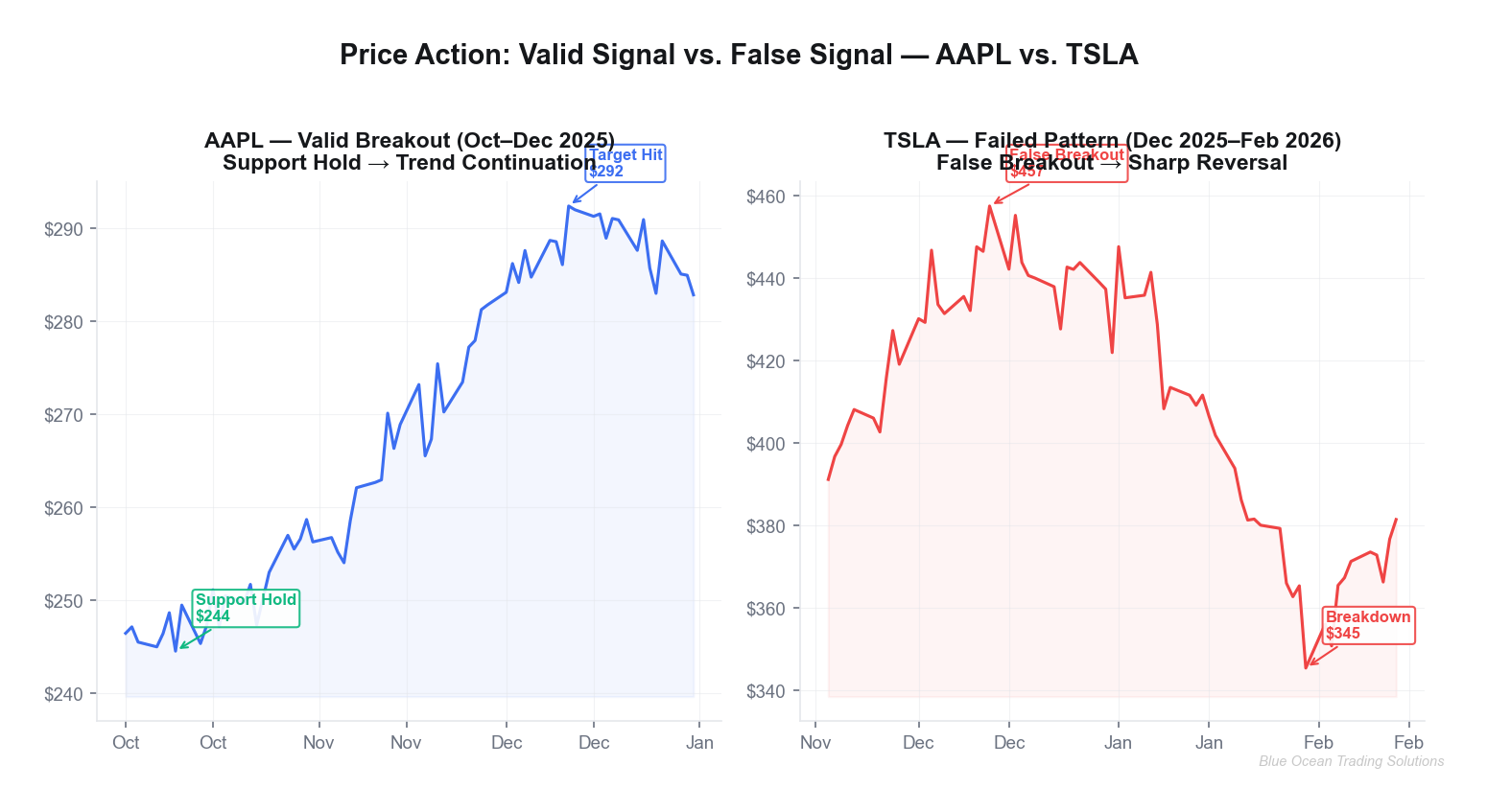
AAPL offered a clean example of trend continuation through the October–December 2025 window. Price held its October support zone near $244 after a brief test on October 9, then staged an orderly advance to $292.38 by December 11. The move was characterized by shallow pullbacks, each finding support above the prior swing high—a structural feature that tells you supply is not materializing at previous resistance levels. Buyers are willing to pay up. That is the definition of a healthy uptrend from a price action perspective.
TSLA offered the mirror image, and a cautionary tale about the false breakout—one of the most common failure modes in price action trading. TSLA ran aggressively from September's $338 into a December peak of $457.45. The tape, at that December high, showed some concerning characteristics: the move was parabolic (the steepest advance of the entire prior trend), volume began to spike erratically rather than consistently, and price failed to hold new highs after touching them. These are distribution fingerprints. By January 30, 2026, TSLA had reversed to $345.48—erasing more than $112 per share in roughly seven weeks.
Key Insight
The difference between AAPL's valid continuation and TSLA's failed breakout came down to one factor: the character of the advance. Steady, volume-confirmed moves with shallow pullbacks suggest institutional participation. Parabolic vertical moves with erratic volume suggest retail euphoria — and a distribution opportunity for those who accumulated earlier.
Risk Management Integration
Stop-Loss Placement from Price Action
Price action gives you a logical, non-arbitrary framework for stop-loss placement that indicators simply cannot match. The rule is straightforward: your stop goes below the most recent structural level that would invalidate your trade thesis.
For a breakout trade, that means placing your stop below the breakout level—or, better, below the last swing low before the breakout. In the NVDA December setup, a stop below the October swing low of $150.96 was the structural choice. If NVDA reversed and broke below that level, the thesis (accumulation complete, markup underway) was incorrect. There is no need to guess at a 5% or 8% stop—the market's own structure tells you where you are wrong.
For support-hold trades, the stop goes below the support zone, not at the support zone. Tight stops at support are the most common way traders get stopped out of perfectly valid setups by normal intrabar volatility. Price action is telling us that the zone, not the precise price, is what matters.
When Price Action Signals Fail
Every strategy fails in specific conditions. Price action fails most often in three circumstances:
Low-liquidity environments: In thin markets, a single large order can push price through a support or resistance level without any change in the underlying supply/demand dynamic. This is why price action signals are more reliable on liquid large-cap equities like NVDA, AAPL, and TSLA than on small-caps or illiquid options.
Binary event windows: Earnings reports, Fed meetings, and macro announcements create discontinuous price gaps that render all prior support/resistance levels temporarily meaningless. Position sizing around these events deserves extra caution regardless of how clean the pre-event setup looked.
Regime changes: The same pattern that works in a trending market fails in a mean-reverting one. A breakout entry in a market that has entered a range-bound phase will be stopped out repeatedly. Volatility context—specifically, whether implied volatility is expanding or contracting—is a useful filter for determining which playbook applies.
Volatility Context
The same breakout pattern carries very different risk profiles in a low-volatility environment versus a high-volatility one. In compressed, low-volatility markets, a breakout above resistance tends to follow through with cleaner momentum because fewer participants are positioned for the move. In high-volatility markets, breakouts are more frequently tested and retested, whipsawing traders who use tight stops. The risk/reward profile here is improved substantially when you widen stops to account for current volatility conditions—even at the cost of smaller position size.
Advanced Variations and Edge Cases
Price Action Across Timeframes
The most important principle in multi-timeframe analysis is alignment. A bullish setup on the daily chart is significantly more powerful when the weekly chart is also in an uptrend and the 4-hour chart shows a clean consolidation before the breakout. Misalignment is a warning: if the daily is bullish but the weekly is at major resistance, that daily setup carries materially higher failure risk.
For execution, the highest-probability approach is: identify the setup on the higher timeframe (weekly or daily), then use a lower timeframe (4-hour or 1-hour) to time the entry. This way, you are trading in the direction of the larger trend while minimizing the entry's distance from your logical stop.
Price Action in Crypto vs. Equities
The core principles of price action transfer directly to crypto markets, with one significant adjustment: the volatility regime is dramatically higher. A support level in Bitcoin carries far more "slippage room" around it than the equivalent level in AAPL. The practical implication is that crypto traders using equity-derived rules for stop placement will be stopped out systematically by the asset class's inherent noise. Wider stops, smaller position sizes, and a greater emphasis on the weekly chart over the daily are standard adaptations.
Volume Profile and the Third Touch Principle
Volume profile analysis—specifically, identifying high-volume nodes (HVN) and low-volume nodes (LVN)—adds a powerful dimension to standard horizontal support/resistance analysis. Price tends to stall and consolidate at HVNs (where a lot of trading activity has occurred historically) and accelerate through LVNs (where little trading history exists). When a standard support/resistance level coincides with a HVN, the confluence substantially increases the probability that the level will hold.
The third touch principle deserves its own mention: a support or resistance level becomes more significant, not less, with each test—up to a point. The first touch establishes the level. The second touch confirms it. The third touch often generates the most powerful reaction, as the level is now widely recognized and participants position against it aggressively. By the fourth or fifth touch, however, the dynamic reverses: a level tested that many times is becoming exhausted. The probability of a break-through increases as the supply/demand dynamic behind the level deteriorates.
Key Takeaways
- Price action is not pattern matching. It is a reading of supply and demand dynamics, conviction, and structural context. Patterns are the output, not the input.
- The Wyckoff framework remains the most durable lens for identifying where a market is in its cycle—accumulation, markup, distribution, or markdown. Volume is the confirmation layer at every phase transition.
- Real examples demand specificity. NVDA's December 2025 breakout from its $122–$165 accumulation range on 1.5x volume was a textbook setup. TSLA's parabolic advance to $457 in December with erratic volume was a distribution warning. The tape was communicating clearly in both cases.
- Stop placement belongs in the chart's structure, not at an arbitrary percentage from entry. Swing lows, range boundaries, and volume profile nodes tell you exactly where your thesis breaks down.
- Context determines validity. The same breakout pattern that generates a 4:1 return in a trending market gets stopped out three times in a row during a choppy, low-conviction environment. Identifying the regime first is non-negotiable.
- The third touch principle and timeframe alignment are advanced filters that substantially improve signal quality. Use them as confirmation, not as primary entry triggers.
Price action is telling us, consistently, that markets are not random. Large institutional participants leave footprints in volume and price structure. Learning to read those footprints systematically—rather than overlaying lagging indicators on top of them—is where the persistent edge lives.
Blue Ocean Trading Solutions provides technical analysis and market research for educational purposes only. This content does not constitute investment advice, a recommendation, or a solicitation to buy or sell any security. All trading involves risk, including potential loss of principal. Past performance does not guarantee future results. Always conduct your own research and consult a licensed financial advisor before making investment decisions.