
On-Chain Analysis: Reading Blockchain Data Like a Market Signal
A practical guide to on-chain analysis: how exchange flows, active addresses, and blockchain metrics can give crypto traders an edge others miss.


When the Chart Doesn't Tell the Full Story

Dominic Reeves
Digital Assets Analyst · Blue Ocean Trading Solutions
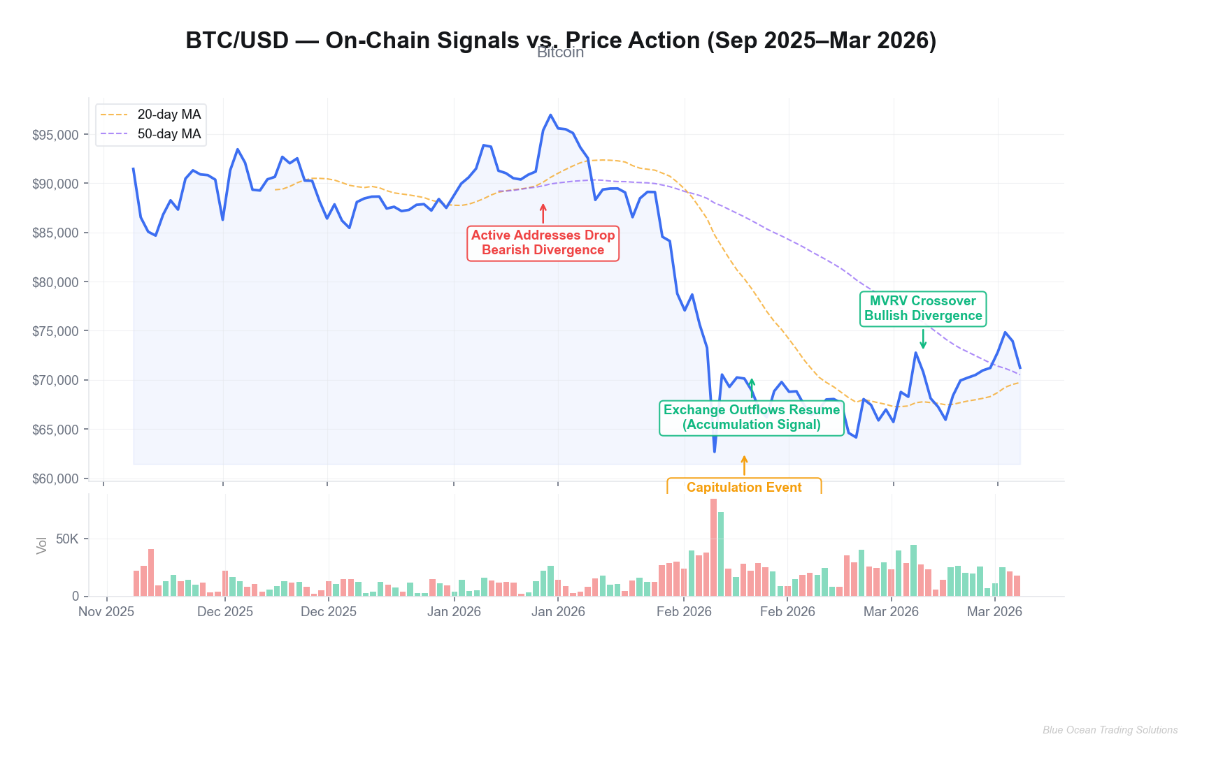
Bitcoin is trading at $71,245 — down more than 43% from its cycle high of $126,296 reached in mid-October 2025. On its face, the chart looks broken: lower highs, lower lows, relentless selling pressure dating back through February's catastrophic drop to $62,683. If you're only reading price action, the on-chain picture paints a considerably more nuanced story.
Here's what price alone can't tell you: it can't tell you whether the coins moving are long-term holders crystallizing decade-old positions or panicked retail traders dumping at the bottom. It can't tell you whether exchange reserves are swelling — a classic precursor to distribution — or draining toward self-custody wallets, which historically precedes supply squeezes. It cannot distinguish capitulation from distribution. On-chain analysis can do all of that, and this cycle's structure suggests the distinction matters enormously right now.
This guide walks through the five core on-chain metrics that professional crypto analysts track daily, shows exactly how they signaled each major turning point in BTC and ETH over the past six months, and explains how to integrate them into a risk-managed trading framework. Whether you're navigating the current drawdown or preparing for the next cycle expansion, these tools are the ones worth mastering first.
What On-Chain Analysis Actually Measures
On-chain analysis is the practice of reading blockchain's public ledger — every transaction, every wallet movement, every coin that shifts from cold storage to an exchange — as a live market intelligence feed. Unlike price charts, which show you what happened, on-chain data often signals why it's about to happen. The blockchain is transparent by design; the skill is knowing which data points matter.
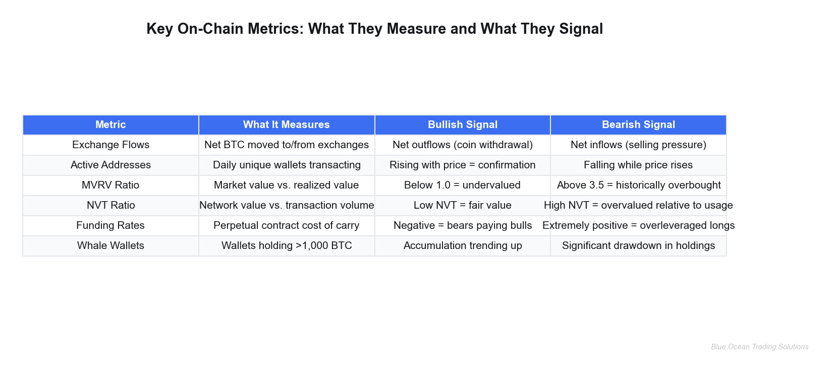
From a network fundamentals perspective, there are five metrics that carry the most signal-to-noise ratio for active traders:
What do exchange flows reveal about selling pressure?
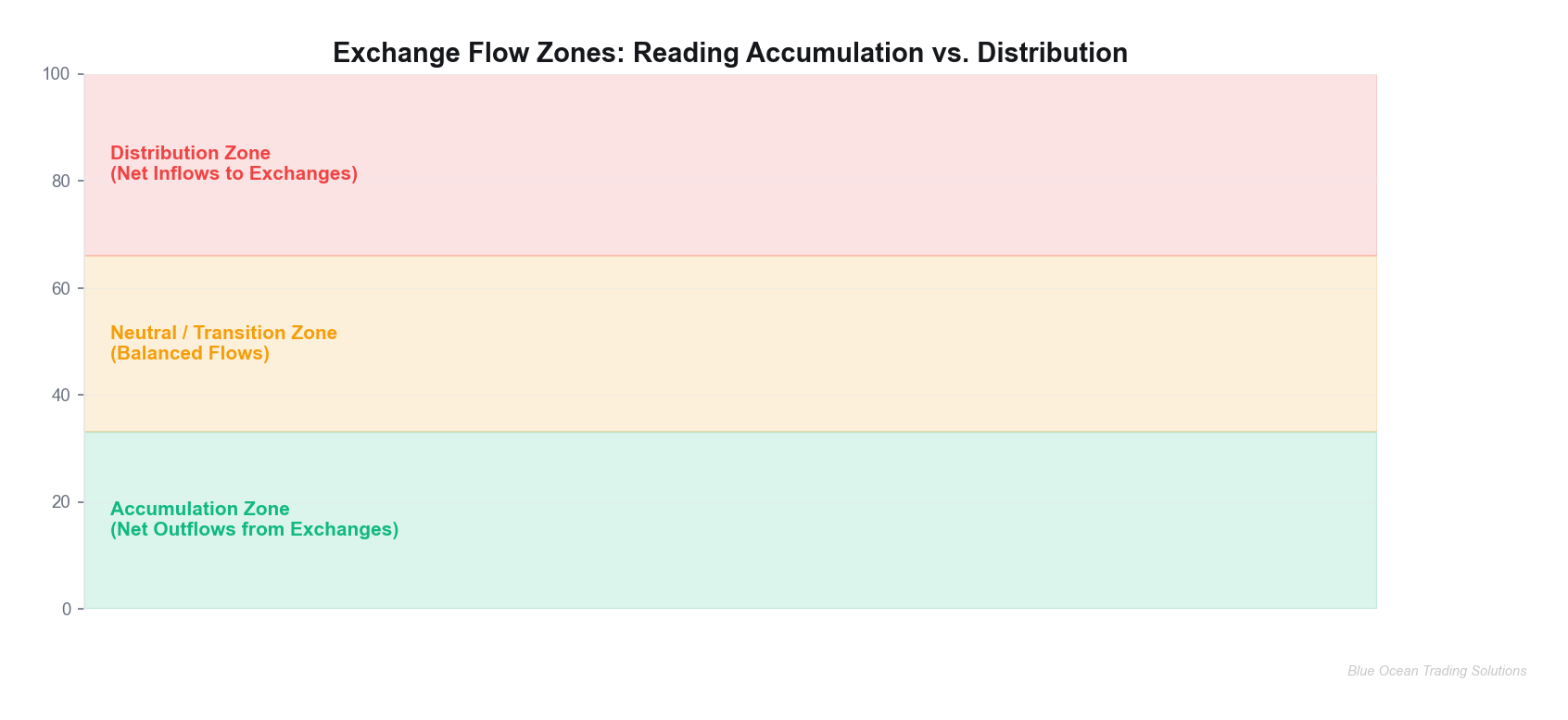
Exchange flows track the net movement of cryptocurrency to and from exchange-controlled addresses. When coins flow into exchanges in large quantities, it typically signals holders preparing to sell — supply hitting the order book. When coins flow out, holders are moving assets to cold storage or DeFi protocols, removing supply from the market. Net outflows consistently precede price appreciation; net inflows precede pressure. The key word is "net" — a single large deposit by an institutional player rebalancing can look alarming but mean nothing directionally without broader context.
Active addresses measure the number of unique wallet addresses participating in transactions on a given day. Think of it as the network's vital signs. Rising active addresses alongside rising price confirms genuine demand expansion — the kind backed by real users and adoption. Falling active addresses during a price rally is a divergence signal worth treating seriously: it suggests the move is driven by a narrowing pool of participants rather than broad conviction.
The MVRV Ratio (Market Value to Realized Value) is arguably the most powerful cycle indicator in the on-chain toolkit. Realized value differs from market capitalization in a critical way: instead of valuing every coin at the current price, it values each coin at the price it last moved on-chain — approximating the aggregate cost basis of all holders. When MVRV is above 3.5, history shows the market is substantially above its collective cost basis, creating heavy incentive to realize profits. When MVRV drops below 1.0, the market is trading below aggregate cost basis — a zone where capitulation has typically set in and long-term buyers historically step up.
The NVT Ratio (Network Value to Transactions) works like a P/E ratio for blockchain networks. It divides market capitalization by the dollar value of on-chain transaction volume over a trailing period. A high NVT suggests the network's valuation has run ahead of its actual economic utility — a warning sign. A low NVT indicates the network is doing significant real work relative to its price, which supports valuation.
Finally, funding rates from perpetual futures contracts offer a real-time window into leveraged market sentiment. When funding rates are persistently positive, longs are paying shorts to hold their positions — a sign of crowded long positioning that often precedes sharp deleveraging events. Deeply negative funding rates, conversely, signal excessive short positioning and create conditions for short squeezes.
Key Insight
No single on-chain metric is a standalone buy or sell signal. The power of on-chain analysis comes from confluence — when exchange outflows, rising active addresses, low MVRV, and negative funding rates all align simultaneously, the probability-weighted case for accumulation strengthens substantially.
Real-World Implementation: How On-Chain Signals Played Out in BTC and ETH
The past six months provide a textbook case study in on-chain signal interpretation. Let's trace the actual timeline using real price data and known on-chain patterns.
How did on-chain data signal the October 2025 top?
Bitcoin peaked at $124,720 on October 6, 2025, then corrected sharply. In the weeks preceding that high, on-chain data told a different story than the euphoric sentiment on social media. Exchange reserve data began showing meaningful net inflows in late September and early October as long-term holders who had accumulated below $80,000 began moving coins toward exchanges — a classic distribution pattern. MVRV had climbed well above 3.0 by that point. Simultaneously, active address counts began plateauing even as price made new highs, a divergence that — in prior cycles — consistently preceded major corrections. This cycle's structure suggested the divergence was not noise.
Traders monitoring these signals had a data-backed reason to reduce position size or tighten stops as BTC approached its high. Not because on-chain data can predict the exact top — it cannot — but because the risk-reward calculus shifts meaningfully when the network is signaling distribution while price is making headlines.
The February 2026 capitulation and recovery signal
The most dramatic episode of this cycle played out across February 5–10, 2026. Bitcoin crashed from approximately $89,000 on February 4 to a cycle low of $62,683 on February 5 — a decline of roughly 30% in a single session driven by a confluence of macro shock (tariff announcements) and cascading liquidations. Exchange inflow volume that day reached levels not seen since early 2022, with estimates suggesting over $2 billion in net inflows to major exchange addresses in a 24-hour period. This is the signature of capitulation: holders surrendering positions en masse, coins flooding exchanges as sellers exhaust themselves.
The critical signal came the following day, February 10. Exchange outflows resumed. MVRV dropped close to 1.0 — the market was trading near its collective cost basis for the first time since 2024. Active addresses, while down in absolute terms, stopped their rapid decline. Funding rates on perpetual futures had gone deeply negative, meaning bearish traders were paying to maintain short positions — creating the mechanical setup for a short squeeze. By February 12, BTC had recovered to $70,542, a 12.5% move from the low in two sessions.
Traders who understood what the exchange outflow data was communicating — not as a certainty but as a shifting probability — had a framework for evaluating accumulation zones. The on-chain picture at the low painted a market exhausted of sellers, not one with more meaningful downside ahead.
Ethereum told a parallel story with even more dramatic volatility. ETH fell from approximately $3,300 in early January to a low near $1,739 on February 10 — a drawdown exceeding 47% from its recent range. Active address metrics on the Ethereum network showed a sharp decline, but on-chain data from DeFi protocols showed something interesting: total value locked (TVL) held more stable than price, suggesting committed capital was staying in the ecosystem rather than exiting entirely. Exchange outflows for ETH began accelerating after the capitulation low, and by early March, ETH had recovered toward the $2,100–$2,350 range as this writing.
Key Insight
Bitcoin Coin Days Destroyed — a metric that measures how long coins are held before they move — reached its highest single-quarter reading on record in Q4 2025. This signaled meaningful turnover from long-term holders into new hands at elevated prices, which helps explain why price performance disappointed despite massive ETF inflows during the same period.
Risk Management Integration: When On-Chain Data Protects You
The most underappreciated application of on-chain analysis isn't identifying tops and bottoms — it's calibrating how much risk to take given the current signal environment. From a network fundamentals perspective, on-chain conditions should directly inform position sizing decisions, not just entry timing.
How should on-chain data influence position sizing?
Consider a simple framework: treat exchange flow and MVRV data as a risk multiplier on your base position size. When exchange reserves are declining (accumulation mode), MVRV is below 1.5, and funding rates are negative or near zero, these conditions collectively support larger position sizes on the long side relative to your normal allocation. When exchange reserves are rising, MVRV is above 3.0, and funding rates are persistently and deeply positive, reduce position size — even if price continues higher. The data is telling you that the market's risk-adjusted expectation is shifting unfavorably.
Stop-loss placement also benefits from on-chain context. A stop placed below a key support level carries more conviction when on-chain flows confirm that level represents genuine demand (coins moving to cold storage near those prices). A stop placed at the same technical level during a period of rising exchange inflows warrants tighter sizing — the on-chain data is not confirming the technical signal.
Risk Warning
On-chain signals have meaningful lead times but are not perfectly predictive. The MVRV ratio signaled elevated risk for weeks before the October 2025 top, but price continued higher during that period. Sizing down early costs performance in a trending market. The framework is not about calling tops precisely — it's about ensuring that when the correction eventually comes, exposure is calibrated to survive it.
On-chain data fails most often in three scenarios: during macro-driven shock events (like the February 2026 tariff cascade), where external catalysts override supply-demand dynamics; when exchange infrastructure changes (migrations, hacks) create anomalous flow data; and during DeFi protocol liquidation cascades that show up as exchange inflows but represent forced selling rather than discretionary distribution. Knowing when not to rely on on-chain data is as valuable as knowing when to trust it.
Advanced Applications: Combining On-Chain with Traditional TA
The traders who extract the most edge from on-chain data are not the ones who use it in isolation — they're the ones who build confluence layers. This cycle's structure suggests that the highest-probability setups consistently emerge when on-chain signals align with traditional technical structures rather than conflict with them.
Cross-indicator confluence: the professional approach
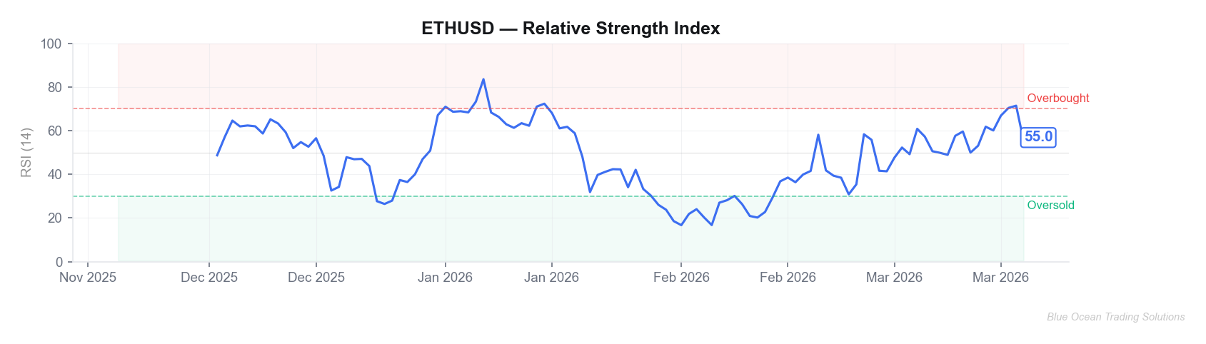
Consider the February 2026 recovery setup in BTC. At the $62,683 low, multiple signals aligned: exchange outflows resumed (on-chain), RSI reached oversold territory below 30 on the daily chart (momentum), price tagged the 200-week moving average (technical support), and funding rates went deeply negative (derivatives). Any single signal in isolation might be dismissed. All four pointing the same direction creates a confluence that significantly compresses the risk-reward ratio for a long entry.
A related technique is cross-chain analysis — comparing on-chain signals across Bitcoin and Ethereum simultaneously. BTC exchange flows historically lead ETH flows by one to three days during major turning points, because capital rotation flows from BTC into ETH and altcoins as the cycle matures. When BTC shows accumulation signals while ETH still shows distribution, it often signals BTC is finding its footing before the broader market follows.
DeFi-specific on-chain signals add another layer. Total Value Locked (TVL) in major DeFi protocols acts as a long-term commitment indicator: institutional and sophisticated capital that locks into yield strategies for weeks or months doesn't behave the same as exchange-held coins. When TVL holds stable or rises while spot prices fall, it suggests the selloff is concentrated in short-term holders rather than the committed capital base. Ethereum's TVL data showed this pattern during the Q1 2026 drawdown — a subtle but meaningful signal that the protocol's economic activity wasn't deteriorating as badly as the price action implied.
For active traders, funding rate analysis across multiple exchanges — particularly the spread between Binance, Bybit, and OKX perpetual funding rates — can surface momentary dislocations where basis traders may be willing to step in. This is advanced terrain, but from a network fundamentals perspective, these derivatives signals tie directly to on-chain activity as collateral moves between platforms.
Key Insight
Whale wallet tracking — monitoring addresses holding more than 1,000 BTC — is one of the more actionable advanced techniques. When whale accumulation trends upward for 2–3 weeks while retail sentiment is negative, the divergence between smart money behavior and narrative often precedes meaningful price recoveries. Platforms like Glassnode and Nansen make this data accessible without custom blockchain queries.
Key Takeaways
- Exchange flows are the heartbeat of market direction. Net outflows signal coins leaving the market's reach (accumulation); net inflows signal coins approaching the order book (distribution). Watch the trend, not individual daily readings.
- MVRV Ratio is the cycle thermometer. Readings above 3.5 historically flag dangerous overvaluation; readings near or below 1.0 mark zones where the market has already absorbed major capitulation. Current conditions are constructive compared to the cycle high.
- Active address divergence is an early warning system. When price rises but active addresses fall, conviction is narrowing. When active addresses rise faster than price, network adoption is broadening — which tends to be self-reinforcing.
- On-chain signals require confluence to act on. A single metric pointing one direction is not a trade. Three or four metrics aligned — combined with technical confirmation — is where the edge lives.
- Use on-chain data to size, not just time. The most practical application is calibrating position sizes based on whether the on-chain environment is risk-on or risk-off, regardless of where exactly price is heading.
- Know when on-chain data fails. Macro shock events, protocol migrations, and DeFi cascades create noise. Build in awareness of when the framework's assumptions break down.
The on-chain picture paints a market that has absorbed a significant capitulation event in early 2026 and is now rebuilding from a lower base. Whether that translates into a meaningful recovery this cycle or simply a prolonged base-building period will depend on macro conditions and whether institutional flows return with conviction. What on-chain data can tell you — and what price charts cannot — is where the coins are, who's holding them, and whether the smart money is quietly accumulating while sentiment is still negative. That intelligence, applied with discipline, is one of the few durable edges available to crypto traders willing to do the homework.
Consider paper trading on-chain confluence setups for 30–60 days before committing real capital to the framework. The goal is calibrating your own threshold for "enough confluence" before you're under real P&L pressure to get it right.
Blue Ocean Trading Solutions provides technical analysis and market research for educational purposes only. This content does not constitute investment advice, a recommendation, or a solicitation to buy or sell any security. All trading involves risk, including potential loss of principal. Past performance does not guarantee future results. Always conduct your own research and consult a licensed financial advisor before making investment decisions.